Most product designers are on a never-ending mission to create things that are easier, faster, and more functional—or as the saying goes, to build a better mousetrap. Designer and architect Katerina Kamprani takes a different approach. For her ongoing project, the Uncomfortable, Kamprani redesigns everyday items and makes them more difficult to use. The pieces, which range from a concrete umbrella to a chain-handled fork, offer an inventive and often humorous take on objects whose utility we’ve come to take for granted. The project was sparked while she was in a postgraduate course in design and interactive studies. "I learned a lot about the term user experience, which refers to the overall experience of a person using a product, especially in terms of how easy or pleasing it is to use,” Kamprani says. “This inspired me to do exactly the opposite. I just thought it was funny to think in an unconventional way and I was amazed by how difficult it was to deconstruct everyday objects in my mind!” AD spoke with Kamprani about her process, favorite designs, and the one object she’s still trying to make uncomfortable.
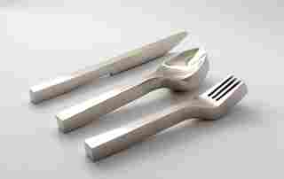
The architect begins the design process by picking the object, such as a set of silverware. “It has to be a very well-known object and simple to use," she says. “I avoid complicated objects and anything that uses technology—these things are already uncomfortable to use after all!”
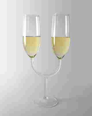
Once Kamprani has chosen an object, the fun begins. “I try to analyze the object and think of ideas to sabotage simple steps in the interaction with it,” she says. “Sometimes I will sketch one or two ideas, but it is not a big part of my process. When I find a good idea that makes me laugh, I do some research to find a reference form that I like, and then I do most of the design in a 3-D program.”
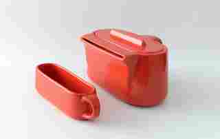
The designs initially lived as 3-D renderings, but Kamprani decided to bring some of them to life as prototypes. About this, she says: "The prototyping process came much later, after I designed most of the items. During the design process, I did not consider production at all, and in a way it was good, because I am sure I would have tried to design with a budget in mind and ended up with completely different forms. The downside was that some of the objects were very difficult or too expensive to produce!”
“My aim was to produce objects that look like they were mass-produced in a factory,” she says of the prototypes. “I collaborated with many different craftsmen like glassblowers, potters, wood turners, and carpenters. For some of the items I used methods like 3-D printing or lost wax casting, and some of them were handmade or finished by me.”
By day, Kamprani works as an architect. She says her personal project doesn’t influence her other designs: “Fortunately there is no apparent connection of my work as an architect and the Uncomfortable, unless I go crazy one day and start proposing uncomfortable spaces to clients! I have a different approach when I design a space in comparison to the design of an object, especially an uncomfortable one. The first has to do more with aesthetics, composition, and form, and the second has to do with more with set goals and user experience.”
Kamprani does admit that she brings an architect’s eye to the Uncomfortable: “There is a lot of common ground for my work and my personal project that has to do more with my skills in presentation and 3-D rendering and my conception of materiality. I also think that I approached the project from the beginning with a concept, a set of rules, and a specific way of presentation, which is more of an architect's approach rather than a self‐expressive approach of an artist.”
One of Kamprani’s favorite designs in the watering can. “Although it happened unintentionally, it seems to me like this watering can has a personality of its own, and looks back on itself, like an introvert watering can,” she says. “Or one that refuses to water the plants!”
After creating prototypes of the designs, Kamprani’s new favorites are the engagement mugs, which are linked together by their handles. “Mainly because it was the most challenging to construct and in the end it worked," she says.
The designer says that the most difficult items to design have been a chair and a spoon. Kamprani is still working to find a solution for a plate and has tried a number of renderings, including one made of fur à la Surrealist artist Méret Oppenheim’s “Fur Breakfast.” “Whatever I design transforms the plate into a different object that is no longer a plate,” she says.
